


Why Colors Matter When Designing a B2B Website
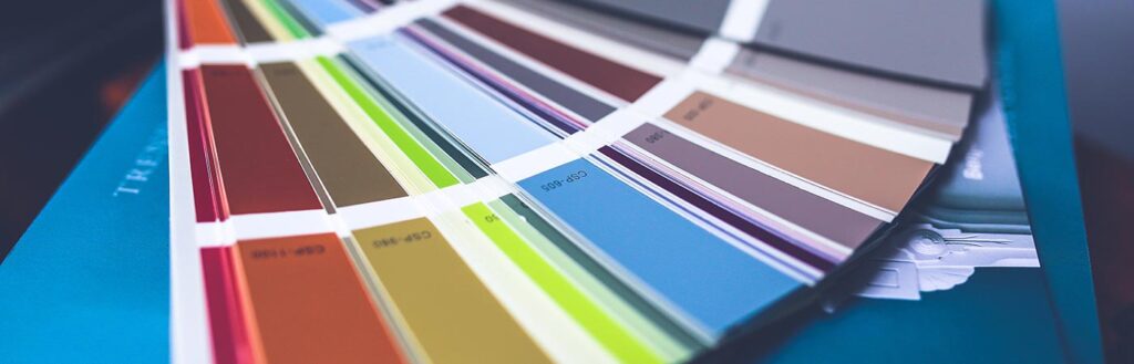
Colors are an essential design element of any website. But too often, brands choose their website colors without understanding how colors appear on a screen. While colors should follow your brand guidelines and convey an appropriate image, they also need to function well on digital platforms. A poorly designed color scheme can have unexpected problems that hinder the UX of your B2B website and drive visitors away.
Here are six colors and colors sets to avoid in your web design strategy:
Light on Light Colors
Light text on a light background is the most common web design faux-pas. The same thing can happen with light text on an overly detailed background. The reason this mistake is so common is because, in print or on certain screens, the contrast between text and background may look fine. But open it on another screen or increase screen brightness, and you may notice that readability decreases.
The solution is to test your color choices on multiple screens. If you think your colors might be too light, you should change them. Fortunately, an easy fix is to place a dark overlay over your background to create more contrast with your light text.
Overpowering Neon Colors
Neon can be fun but on a screen, it’s overwhelming. Keep in mind that screens are backlit, so digital colors tend to look even more vibrant than they do on paper. When testing colors, you need to reference a digital stylesheet to get an accurate measure of how colors will look to your audience.
If you must use neons, use them sparingly or as an accent. Color schemes that include neon should include just as much of a neutral color to give your audience a chance to rest their eyes. Neon lettering also tends to bleed into the background, so avoid neon text. A better choice is to use slightly “off-neon” colors that are either darker or more pastel than their original counterparts.
Rainbow Themes Affect UX
Rainbow is too much for a website. Like neon, a rainbow theme is overpowering and may distract from your actual content. Unless rainbow is integral to your brand image, stick with a few select colors to communicate your brand. Brand guidelines can dictate the color families you choose. Consider cool vs. warm colors as well as color associations.
But if you’re set on rainbow, consider using subdued tones like pastels or dark overlays. Refer to your brand guidelines, but don’t apply them blindly. Consider different aspects of UX, including readability and ease of navigation.
Avoid Too Many Bright Colors
Colors don’t have to be neon or rainbow to be overwhelming. Bright colors, especially placed next to each other, will tire out your visitor and may even have a “vibrating effect.” They appear to be moving or shaking on a screen. Colors are more likely to have this effect when they are highly saturated and complimentary on the color wheel.
One easy way to test your colors is to convert them into grayscale. If their values are hard to distinguish in gray, they’ll be equally difficult to read in color, which leads us to the next point.
Consider Web Accessibility Challenges for the Colorblind
During your B2B web design process, don’t forget to consider colorblind audiences. This is when comparing color values on a grayscale is especially useful. One common pairing to watch out for is red and green. In color, red and green look entirely different. But their grayscale values are very similar.
Deuteranopia, or red-green colorblindness, is more common than total color blindness. So if you use reds and greens in your color scheme, avoid putting them into your text or place another color in between the two as a buffer.
Watching the colors you use is important to avoid causing friction for users with visual impairments. Everyone should be able to access your website equally regardless of their disabilities. When you redesign your website, make sure you’re keeping accessible website design top of mind.
Partner with a B2B Website Design Agency
Take care in your colors choices and avoid these six pitfalls when redesigning your website. For help choosing the best colors for your B2B website redesign, contact us today. BNP Engage is B2B website design agency with 15+ years of experience designing visually impactful, accessible websites. We’ll help you maximize the success of your new website and boost your overall marketing strategy along the way!