


Your Website Is Talking to Buyers. What Is It Actually Saying?
A Three-Part Series on Credibility, Clarity, and Conversion
Long before a sales conversation begins, before a proposal is requested, before a referral is confirmed, your website has already communicated something to a prospective buyer. The question is… is it communicating what you intend?
For B2B companies, particularly those operating in technical or regulated industries, a website functions as more than an online brochure. It acts as a credibility filter. It either reinforces authority and strategic focus, or it subliminally introduces uncertainty.
This three-part series examines how websites influence buyer perception well before a conversation takes place.
- Part One focuses on visual experience and accessibility, and how those elements shape immediate judgments.
- Part Two examines structure, proof, and tone, and how those elements reflect operational discipline.
- Part Three addresses persona alignment, revenue influence, and the strategic role of the website in modern B2B growth.
Buyers Read More Than Your Words
When your ideal customer visits your site, they’re’ not simply reviewing services. They’re’ evaluating risk, asking themselves:
- Does this company understand my industry?
- Do they appear organized and disciplined?
- Do they communicate outcomes?
- Can I trust them with my budget and reputation?
These judgments form very quickly and they’re shaped by language, design coherence, structure, and usability.
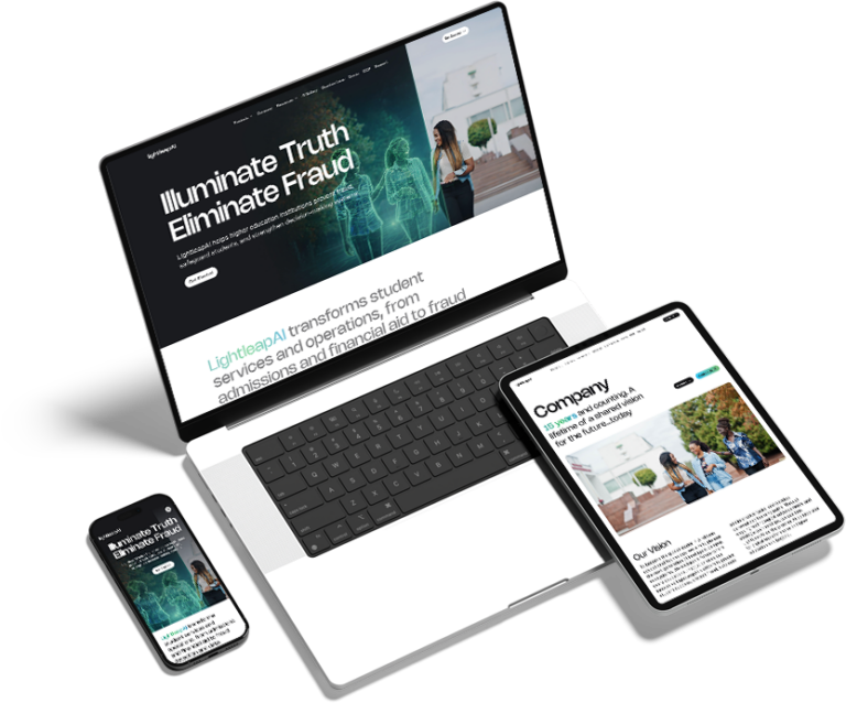
The Visual Experience Is Part of the Message
First impressions happen fast. Research published in Behaviour & Information Technology found that users form aesthetic judgments about websites within 50 milliseconds.
The visual presentation of your website sends an immediate signal. Imagery, layout, spacing, motion, and responsiveness all communicate something about how your company operates.
If a site appears outdated, cluttered, or inconsistent with contemporary standards, buyers draw conclusions. They may not articulate those conclusions, yet they influence whether the visitor continues exploring or exits altogether.
A modern, thoughtfully- designed website communicates attentiveness and relevance. It suggests that the company invests in its own positioning and understands the expectations of today’s decision makers. In competitive B2B markets, those signals often determine whether a conversation take.
Accessibility Is Mandatory
Beyond aesthetics, accessibility has become a baseline expectation.
The World Health Organization estimates that roughly 16% of the global population lives with some form of disability, representing a massive segment of potential users.
An accessible website ensures that users with visual, auditory, cognitive, and/or mobility limitations can navigate and understand your content. This includes readable typography, appropriate color contrast, logical heading hierarchy, descriptive alternative text for images, keyboard navigation support, and clearly labeled links.
B2B companies need to have inclusive standards. An inaccessible site suggests inattention to detail and undermines claims of operational rigor.
There is also a strategic angle. Accessibility improvements enhance usability for all visitors. Clear hierarchy strengthens search visibility. Logical navigation reduces friction for time-pressed executives evaluating vendors.
Inclusive design strengthens both ethics and performance.
Up Next
At Engage, we understand these website essentials and make them a priority in everything we build. Ready to get started? Reach out and let’s talk about what we can do for you.
In Part Two, we examine how structure, proof, and tone communicate discipline and authority long after the first visual impression.