


Eight Website Design Mistakes that Impact Accessibility
Accessibility is a crucial aspect of web design. Making a website accessible ensures that everyone can perceive, understand, navigate, and interact with the content regardless of their abilities. While accessibility is a legal requirement in many countries, it’s more importantly an ethical and inclusive approach to design that promotes equal access and equal opportunities for all users.
The set of guidelines that governs accessibility best practices is called Web Content Accessibility Guidelines (WCAG). The WCAG guidelines consist of three compliance levels, A, AA, AAA, with A having the fewest requirements and AAA having the most.
However, there are some common mistakes that even website designers and front-end developers make when it comes to accessibility. Read on to find out the eight common mistakes we see on business websites and how to avoid them.
Mistake 1: Insufficient color contrast
When reading content, low color contrast between text and background can be a roadblock for people with low to no vision. It’s important to ensure that there’s enough contrast between your text and each page’s background colors to maintain readability. Use free accessibility checker tools like Colour Contrast Checker or Adobe Color to test the color contrast levels.
Mistake 2: Lack of alternative text for images
Including image alternative text (also known as alt text) helps people who rely on screen readers to understand on-page content. Not providing descriptive alt text can make it difficult for these users to understand the context and meaning of the images. As a result, they may miss key information when scrolling through your website.
Mistake 3: Poor keyboard navigation
Many individuals rely on keyboard navigation to browse websites. Failing to provide proper keyboard accessibility can make it impossible for these users to navigate and interact with your website effectively. Ensure that all interactive elements, such as menus, buttons, and links, can be accessed and operated using the keyboard only.
Mistake 4: Inaccessible forms
Forms are an integral part of most websites allowing for lead generation, customer support, data entry, and more. But forms can pose accessibility challenges if not designed properly. Be careful not to: use vague or uninformative labels, provide clear instructions, or properly associate labels with form fields. Make sure your forms are well-structured, have clear labels, and are easy to navigate for all users.
Make 5: Lack of captions or transcripts for multimedia content
It’s very common and even recommended to add videos and audio content to a website. But without captions or transcripts, individuals with hearing impairments won’t be able to access the information presented in these formats. Always make sure to add accurate captions or transcripts for any videos or podcasts to ensure all of your website visitors can gain the same information.
Make 6: Unstructured heading hierarchy
Proper use of heading tags – called h1, h2, h3, etc. – is essential for screen reader users to navigate and understand the structure of your website. Using heading tags incorrectly or inconsistently can make it difficult for users to comprehend how your content is organized. Ensure that your heading hierarchy is logical and follows a proper structure.
Make 7: Missing or ambiguous link text
A link without any accompanying text is an obstacle to many types of users. For example, if there is a linked icon without any indication of the presence of a link, many users will not realize the icon is interactive. In order for links to be readable by screen reader, links should all contain either plain text, or in the case of a linked image, alt text describing where the link points.
Make 8: Ignoring responsive design
It’s crucial for your website’s design to be responsive. This means that your website can adapt to different screen sizes and still offer a seamless user experience (UX) whether a user interacts with it on their computer, phone, or tablet. Disregarding how a site looks on different devices can lead to content that’s inaccessible or confusing to navigate. Be sure to test your website on multiple screen sizes to ensure a consistent experience.
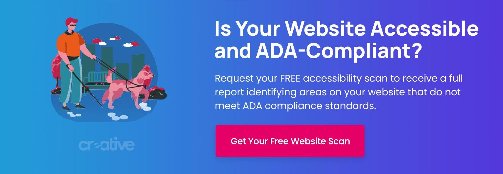
Request a Free Website Accessibility Checker
By avoiding these common web design accessibility mistakes, you can create websites that are inclusive and accessible to all users. Remember to test your website using tools like WAVE, aveDev Tools, Chrome Lighthouse, etc. If possible, consider involving users with disabilities in the design and testing process to ensure a truly inclusive experience.
Don’t miss out on engaging a wider audience due to accessibility issues. At BNP Engage, we offer a free design accessibility checker. Click here to request a scan and find out how you can enhance your website to meet ADA compliance and connect with more customers.